


The challenge
This Children Farm has a strong social media presence, and most of their audience finds them there. Their website doesn’t do the same work. The homepage feels cluttered, and visitors struggle to find what they need, so many leave without exploring further. With 51.52% bounce rate (checked on SimilarWeb), that's more than half of visitors view only one page before leaving.
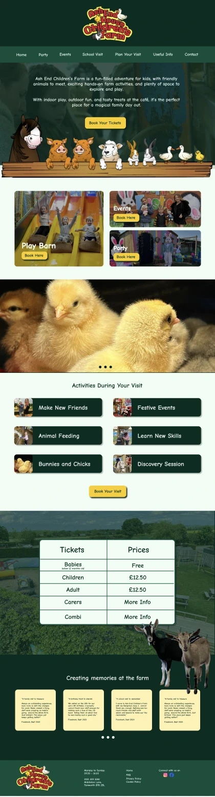
For this concept, I redesigned the homepage to better reflect the farm’s fun, friendly character and turn more visitors into customers. The focus was on:
A clear navigation structure
Strong calls to action
Easy-to-find offerings and pricing
Better content hierarchy, so the page flows naturally
Less clutter and friction, means clearer decisions.
The goal
The goal was to create a homepage that feels as fun and welcoming as a visit to the farm. By simplifying the layout and making pricing and booking easy to find, the aim was to keep visitors on the site for longer and turn more of them into customers.

The design intent
I wanted the homepage to feel like the start of a day out: bright, friendly and easy to follow.
Playful but calm
With earthy colours and imagery, and enough space so nothing feels crowded.
Clear hierarchy
The most important information always comes first: what’s on, what to do, how much it costs and how to book.
Simple navigation
Fewer menu items, grouped in a way that makes sense to busy parents.
Visible calls to action.
Booking buttons placed where people naturally look, so the next step is always clear.
The outcome
The redesigned homepage gives families a clear path from first glance to booking. Offerings and pricing are easy to compare, the navigation is simpler, and the farm’s fun personality now comes through on the website as well as on social media.
Draft design
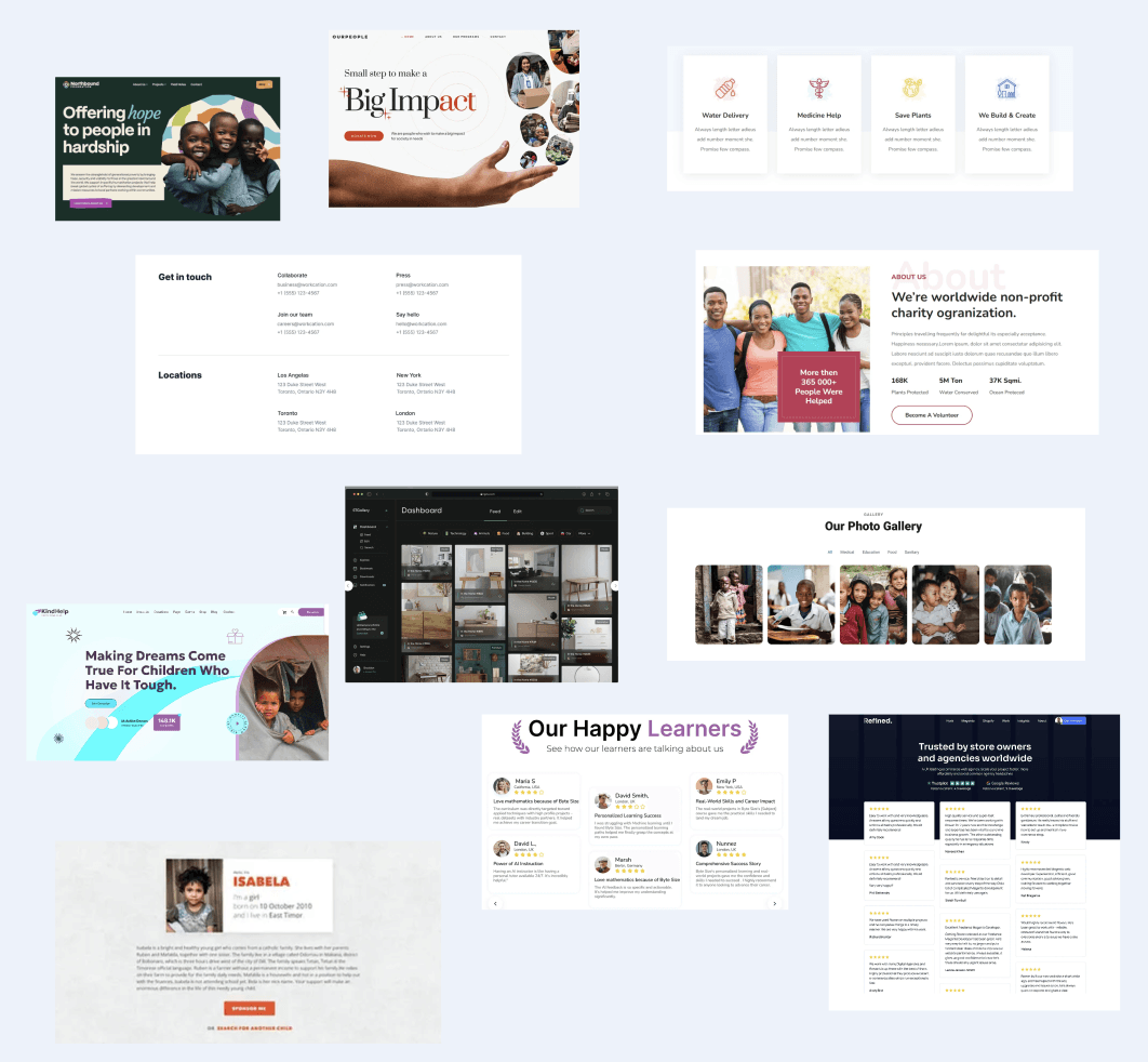
I explored and researched what’s working for competitors and made a mood board to spark ideas that align with YOPEY and its audience.

Research/competitor analysis
I explored and researched what’s working for competitors and made a mood board to spark ideas that align with YOPEY and its audience.
Disclaimer*
This independent, non-commercial concept/personal project was created solely for portfolio purposes. It is not sponsored, approved, or endorsed by the company listed on this page. All names, logos, and trademarks appearing in this project remain the property of their respective owners and are used only for illustrative purposes.


Contact panel