
To refresh and modernise an outdated website, I redesigned 10 pages and updated 14 pages of the charity's website using content provided by stakeholders to better reflect their current vision and mission. This included streamlining their WooCommerce functionality, improving redirections to enhance the customer experience.
Client project
Non-profit charity
Full website redesign
Role
Web Designer
UI Designer
Webmaster
Tools
WordPress DIVI
Figma
Canva
Timeline
Eight weeks
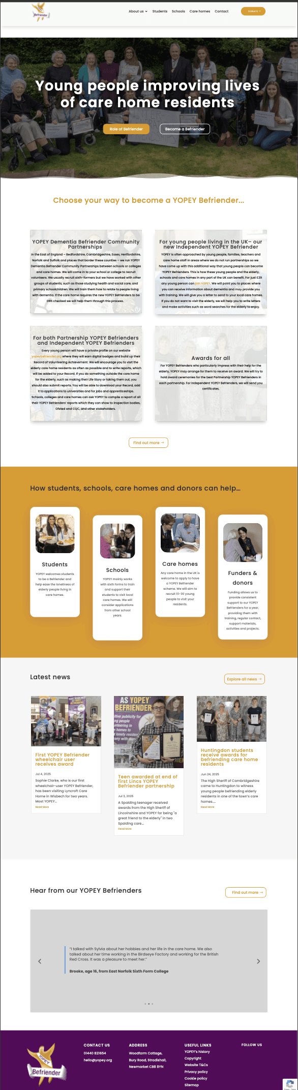
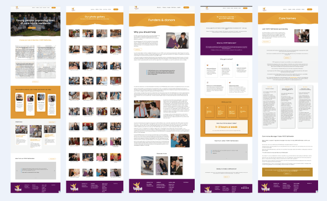
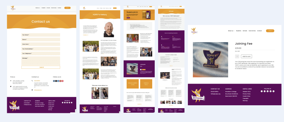
I redesigned 10 pages and updated 14 pages of the website to enhance the long-term value of the website.
This approach focused on three key areas: enhancing user experience, maintaining a consistent visual design, and optimising the website's overall performance.
I redesigned the website to enhance user experience and ensure consistency in both visual elements and functionality, resulting in an improved and responsive website. I collaborated closely with the founder to ensure that the new design aligned with the brand guidelines and their goals, while also being adaptable for future growth.
The main challenge of this project was that the website followed a blog-style format, leading to overly dense, text-heavy pages that were difficult to read and navigate. Much of the content was also outdated, which reduced the site's credibility and the lack of clear navigation and structure made it challenging for website visitors to find relevant information.
“Kim refreshed yopey.org with creative design and clear navigation, transforming a dated site into a responsive, user-friendly website for our audiences.”
Tony Gearing, founder of the charity
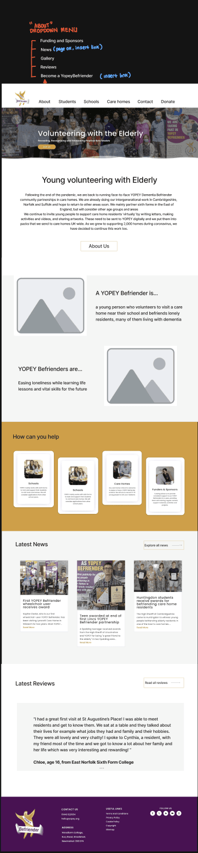
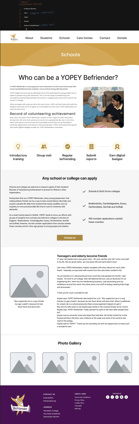
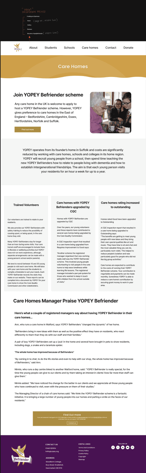
Final design
Mobile version
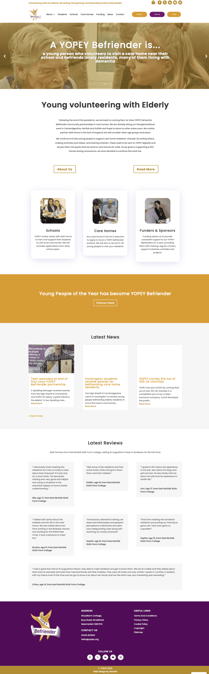
Original website (desktop)
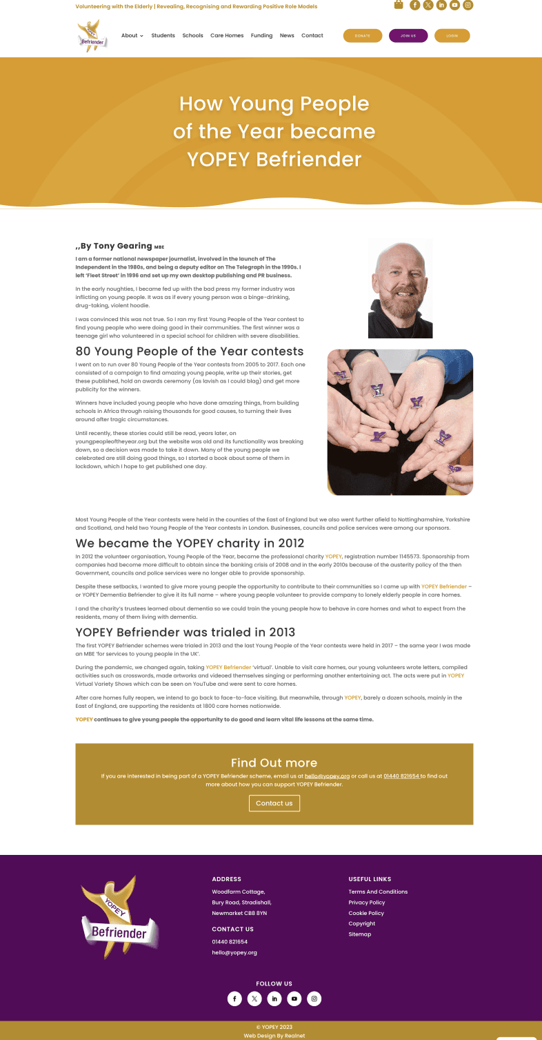

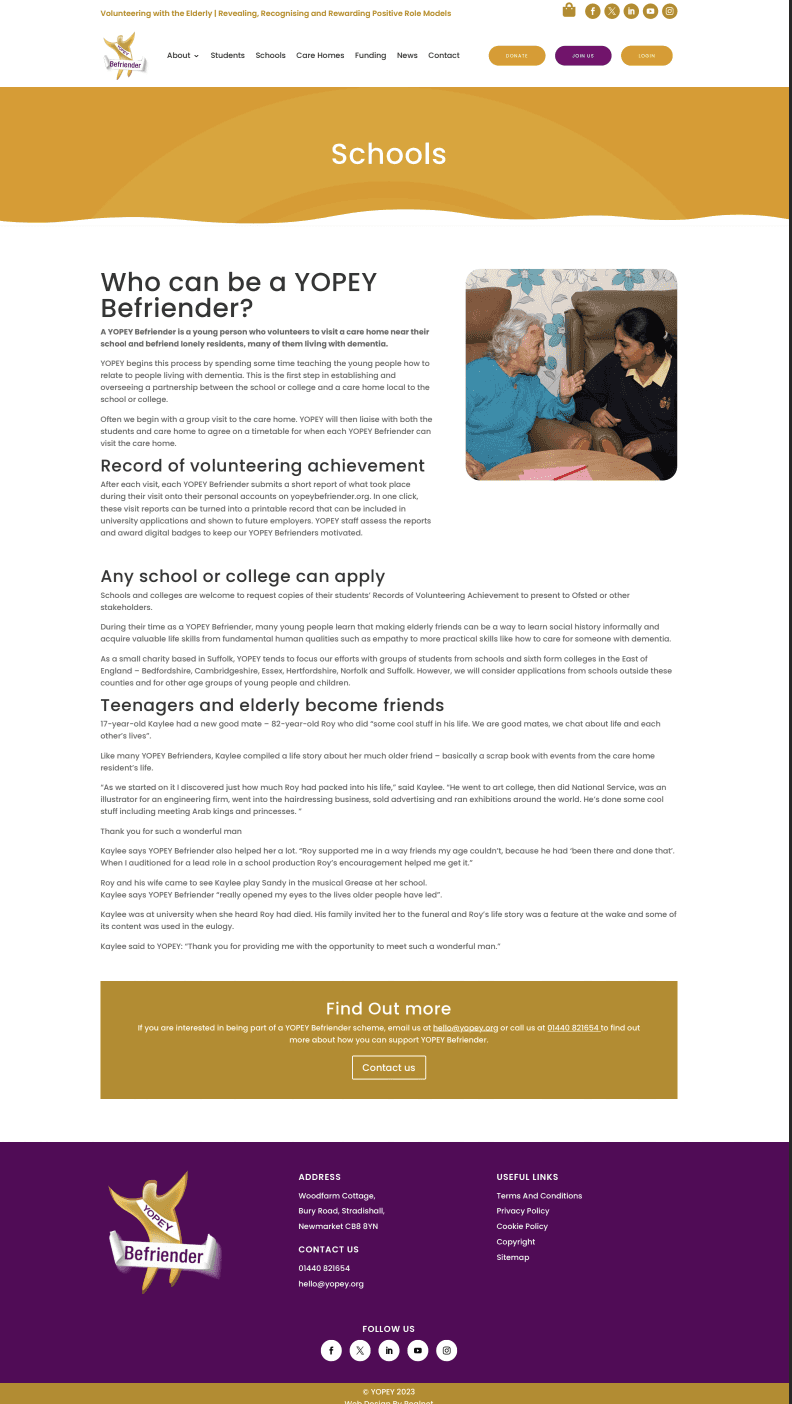
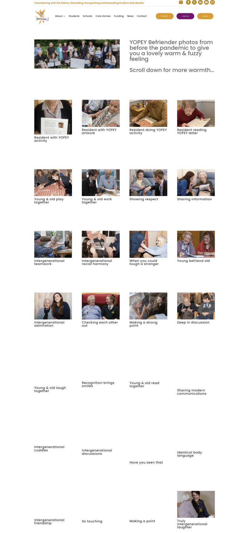
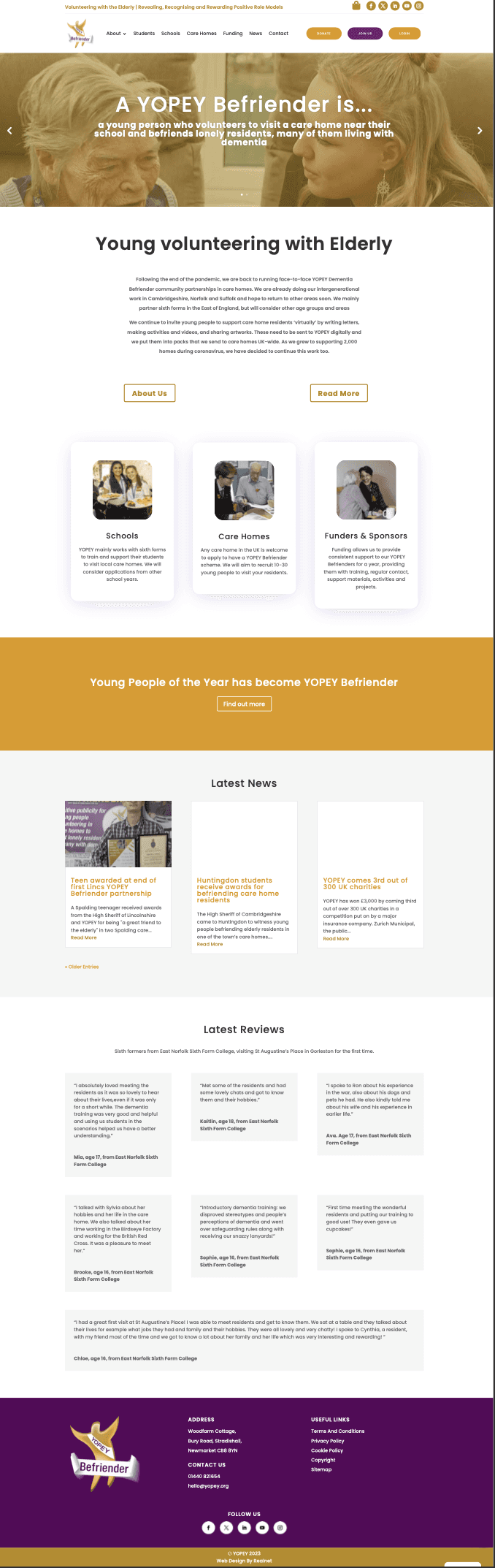

Design phases
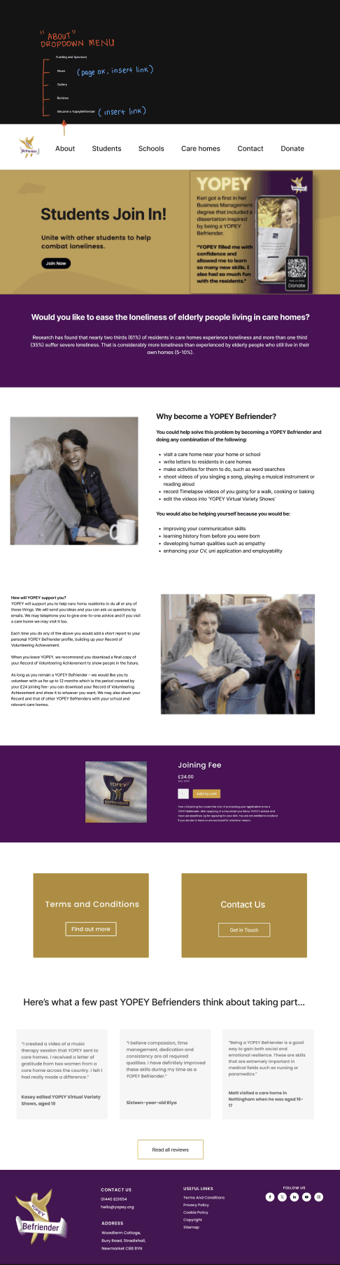
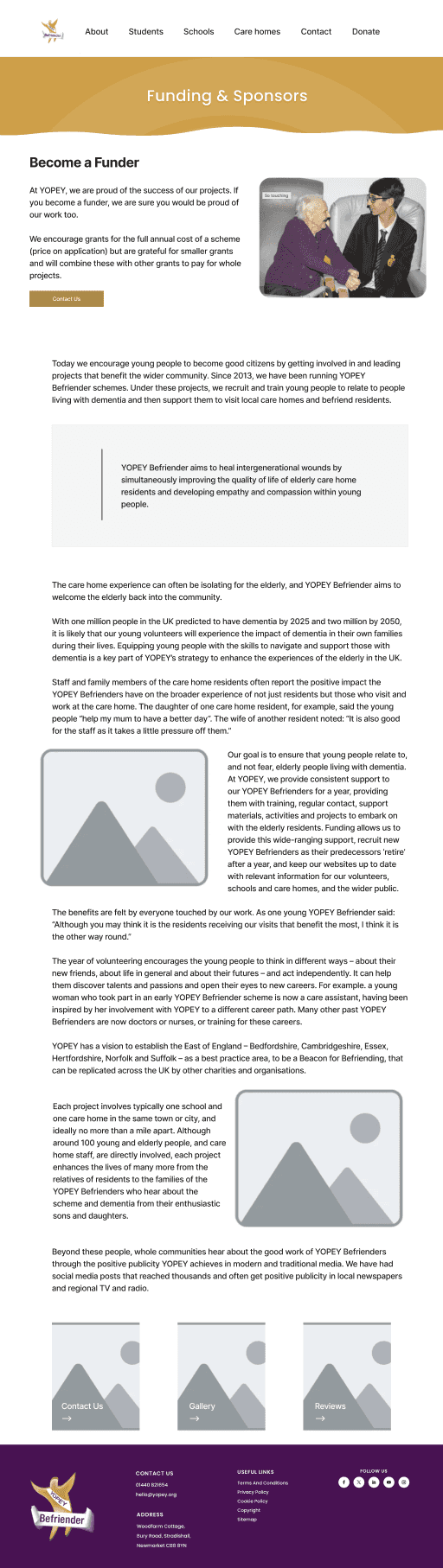
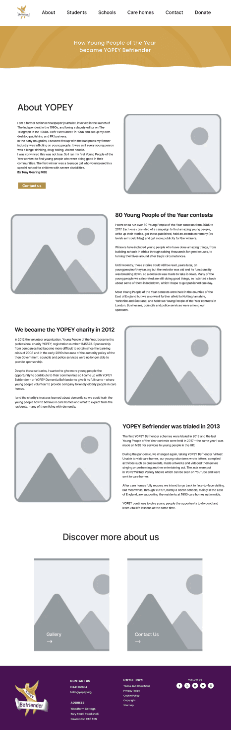
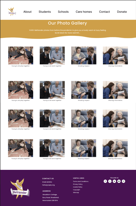
Designed initial wireframes and revised based on stakeholder feedback.
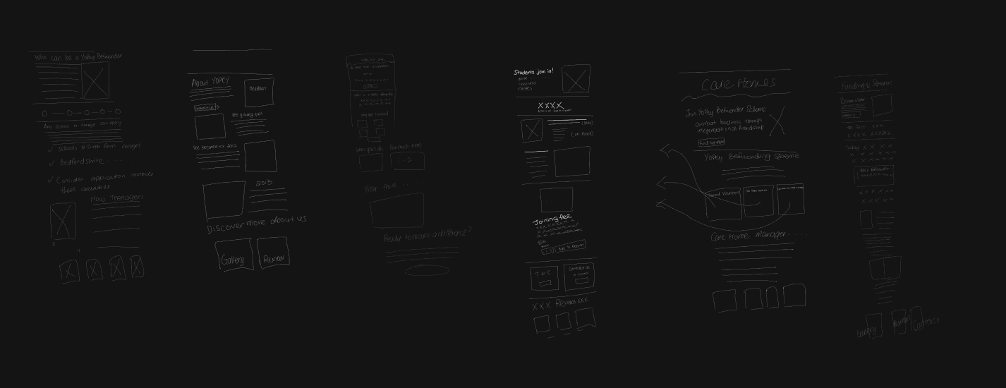
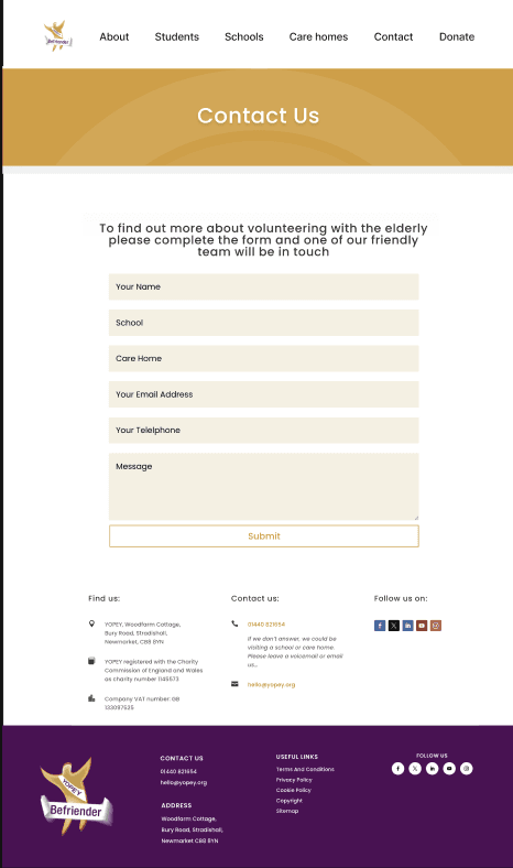
Drafts design
Research/competitor analysis
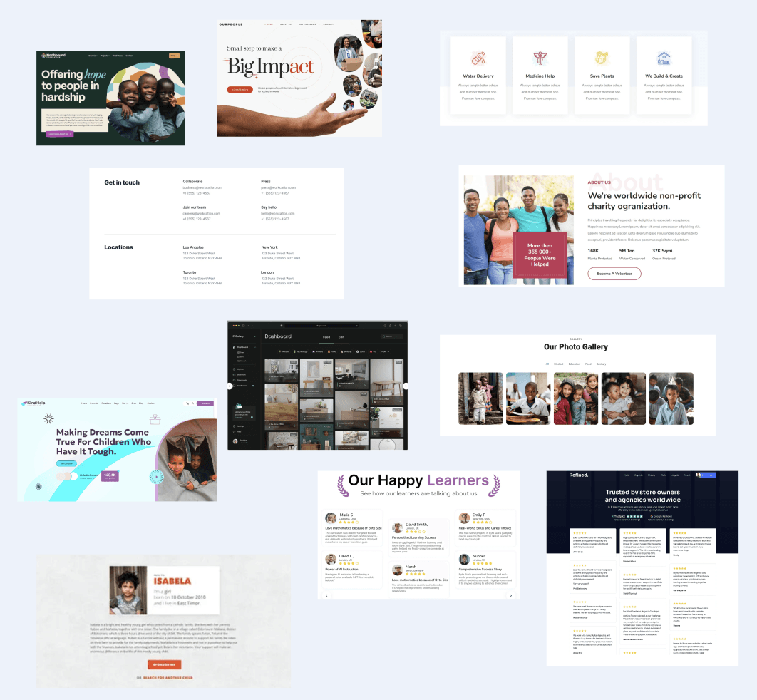
I explored and researched what’s working for competitors and made a mood board to spark ideas that align with this charity and their audience.
Book your FREE discovery call today!