
Challenge
Objective
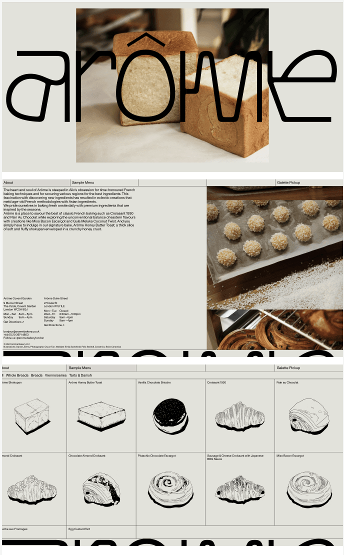
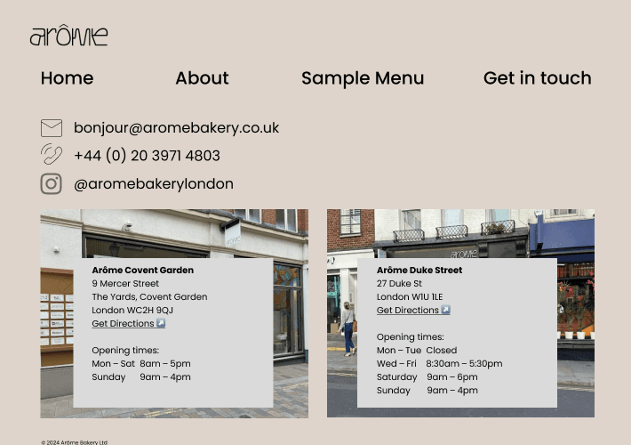
This bakery needs a website refresh to enable website visitors to discover their in-house selections prior to visiting one of their branches. Visitors should have a clear overview the bakery’s history and background, what makes them stand out from other bakeries, what they are selling, and where they are located.
Solution
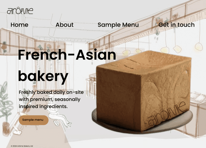
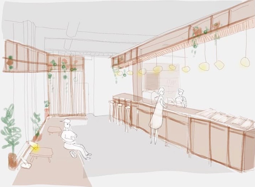
To revamp this website, I have introduced a homepage that reflects the history of the bakery on the landing page. The background illustration is a representation of one of their location, with ‘freshly baked on-site’ as their tagline and a foreground image of their bestselling product.
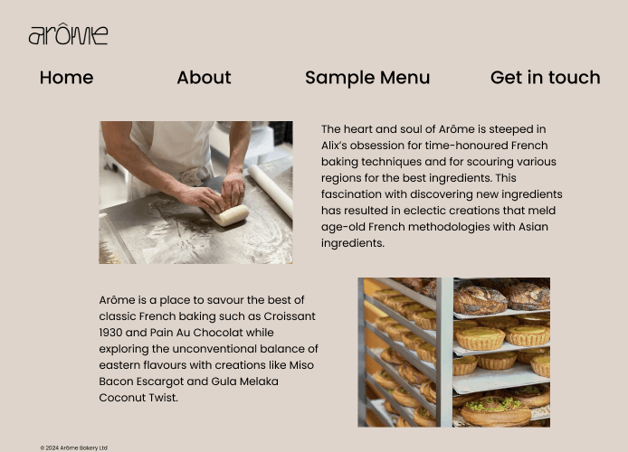
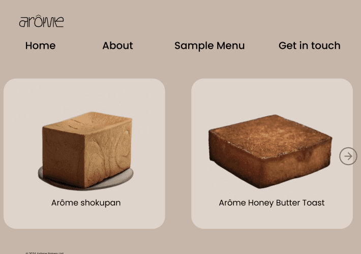
I have also separated the “about me” page to include the background story of the bakery, and included a carousel to showcase all of the bakery’s pastries that they’re selling in store.
Typography
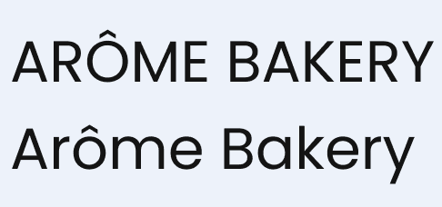
Headers: Poppins 96px. Poppins is an internationalist addition to the genre of Geometric sans serif typefaces. Each letterform is nearly monolinear, with optical corrections applied to stroke joints where necessary to maintain an even typographic color. The Devanagari base character height and the Latin ascender height are equal; Latin capital letters are shorter than the Devanagari characters, and the Latin x-height is set rather high.
Body: Poppins 24px.

Icons
The Icons used in this project consist of email, mobile phone and instagram icon.
Graphics
The graphic I chose for this project is from the very first sketch of Arome, shared on Arôme bakery’s instagram account.
This illustration conveys the design of their stores, which are characterised by their vision. "Lined in wooden panels and washed with warm light, Arome harbours a moment of respite from the inner city life."
Incorporating this graphic into the revamped website was essential, as it authentically represents the beginning of Arôme Bakery.

Colour Palette
Main brand colours: #EEE2DB | #DFD2CA
Buttons: #C1834A
Disclaimer*
This independent, non-commercial concept/personal project was created solely for portfolio purposes. It is not sponsored, approved, or endorsed by the company listed on this page. All names, logos, and trademarks appearing in this project remain the property of their respective owners and are used only for illustrative purposes.
Book your FREE discovery call today!